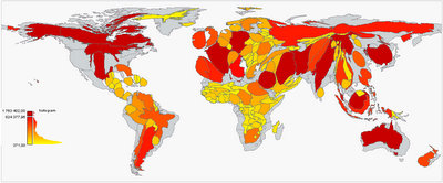
Rumble: The worldmap according to the press
Nicholas Kayser-Brill and Gilles Bruno illustrated how the world map looks like, if we would resize the countries of the world, according to the coverage they get in the world press:
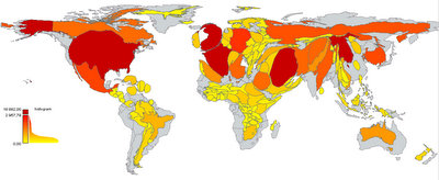
The world according to the Economist (UK):
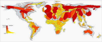
The world according to the blogosphere (World):
 Peter. Flemish, European, aid worker, expeditioner, sailor, traveller, husband, father, friend, nutcase. Not necessarily in that order.
0 comments:
Post a Comment